
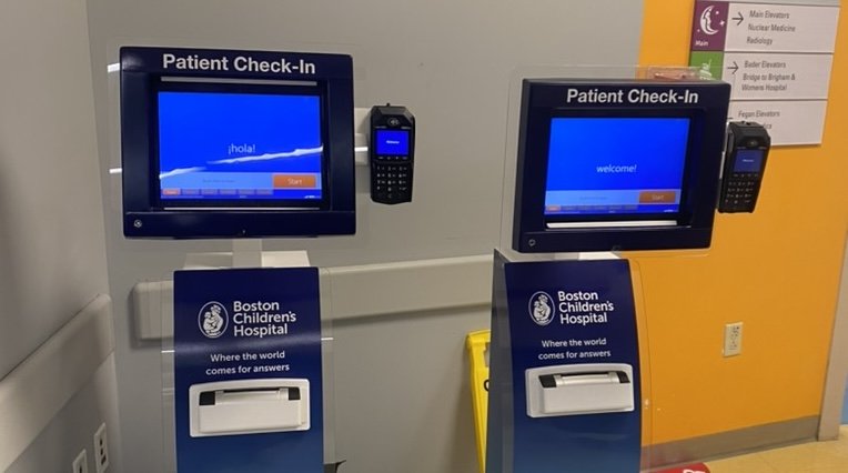
Patient Check-in Kiosk
Boston Children's HospitalJun 2024 – Aug 2024
About Boston Children’s Hospital (BCH)
Boston Children's is ranked among the best in the nation by U.S. News and World Report. It is home to the world's largest pediatric research enterprise, and it is the leading recipient of pediatric research funding from the National Institutes of Health. It is the primary pediatric teaching hospital for Harvard Medical School.
The Digital Health team at Boston Children's aims to enhance all aspects of patient experience - from office visits to inpatient stays - to ensure patients receive the best care no matter where they are.
Project Description
Boston Children’s Hospital had a new big update in June 2024 in which a new system for both kiosk check-in and online echeck-in has been newly implemented. I conducted a series of research to test and improve the over all experience, including field visits, usability testing and diary study.
Impact
Provided and performed design requirements and leading to a 20.6% increase in kiosk check-in usage.
Kiosk Check-in Field Study (Site Visits)
Background
Boston Children’s Hospital is trying to encourage patients to use the kiosks to check in when they arrive. However, the kiosk usage has been very low in the past at around 2%. The digital health team developed a field study to gather data directly from patients and I visited the hospital every Wednesday for two months.
Results
I gathered insights provided weekly updates with design suggestions (actionable recommendations) that improved the patient experience and increased kiosk usage to ~25% at the end of the study.
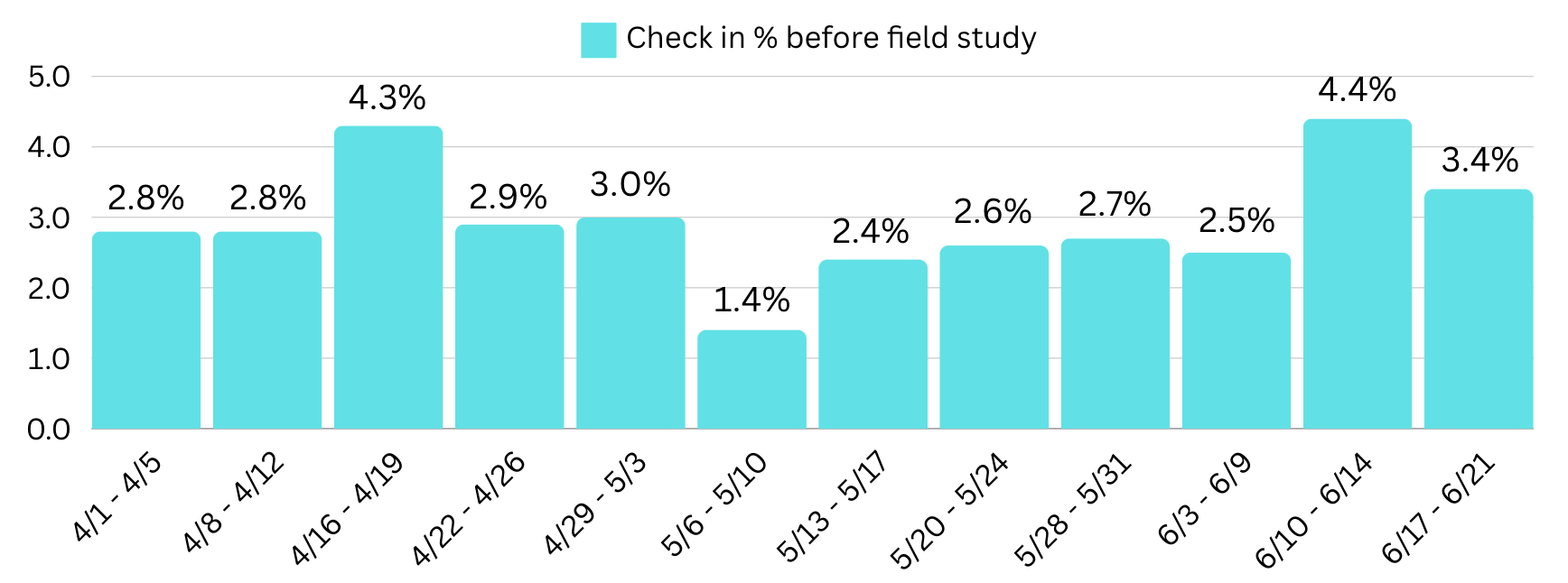
Kiosk usage before field study
Before the study was launched, only 2.9% of all patients who used the kiosk to check in for their appointments. The graph below shows the data 2.5 months before the field study.
Research finding 1
Patients weren’t noticing the kiosk
Design recommendation 1
Moving kiosks to a more noticeable area and put up new signages
Signages were then tested weekly to see if patients are noticing them, and we had 4 updates until the final design is placed
We also added footprints in front of the elevator to lead patients to the kiosks


Research finding 2
Repetitive or unnecessary steps (photo screens, signed documents) are causing frustrations
Design recommendation 2
Remove unnecessary photo screen, especially for patients who are too young or not available to stand and take photos
Link documents to the online check-in portal, if some documents have been signed and still active from previous visits or online, patients will not need to go over them again at kiosks

Research finding 3
Scrolling consent form takes a long time, especially for people with long nails
Design recommendation 3
Implement an auto scroll function for documents and bring users to the signature spot


Research finding 4
Patients preferred human interaction after all
Design recommendation 4
If the patients have a strong preference for human interaction, they could still go check in at the front desk
Staffs, nurses and doctors are encouraged to let patients know about the kiosk check in system to skip the line
Kiosk usage after field study
After implementing changes from research updates weekly, patients who used the kiosk to check have increased from 2.9% to 23.5% on average. More patients mentioned they are likely to keep using the kiosk for their future appointments since they had a smooth experience.
